Web Design
How to Build a Design System You Can Actually Maintain
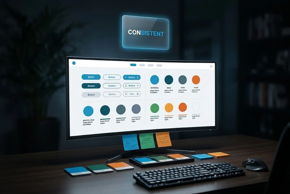
Tokens, components and naming conventions that keep a growing website consistent.
Animation is one of the easiest things to overdo in web design. Used well it makes an interface feel responsive and clear. Used badly it distracts, delays and frustrates.
This guide covers how Rankwyre uses motion as a tool for communication, so it guides the user rather than competing with the content.
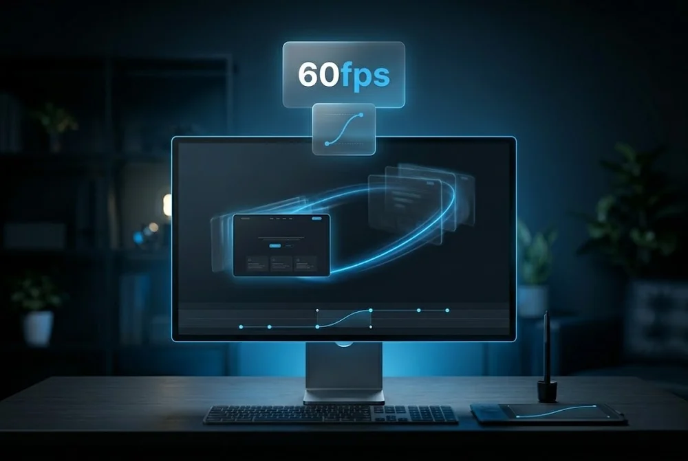
Good web animation guides attention, confirms actions and shows relationships between elements. Keep motion fast, around 150 to 300 milliseconds, give it a clear purpose, respect reduced motion preferences, and never let it slow the page or steal focus from the content.
Every animation should answer a question for the user. Did my click register? Where did this panel come from? What is related to what? If a piece of motion does not communicate something, it is decoration that costs attention.
Before adding an effect, name its purpose. Feedback, orientation and continuity are good reasons. Look at me for no reason is not.
Interface motion should feel instant. Most transitions land best between 150 and 300 milliseconds, with easing that starts quickly and settles gently rather than a robotic linear slide.
Slow animations make a fast site feel sluggish. When in doubt, shorten the duration. Users notice delay far more than they notice elegance.
Small responses to user actions, a button that depresses, a field that confirms input, a subtle state change on hover, reassure people that the interface is working.
These micro interactions are where motion earns its keep. They are cheap to build, they reduce uncertainty, and they make a product feel considered.
Animation must not block the main thread or trigger layout shift. Animate transform and opacity rather than properties that force reflow, and keep scroll effects light.
Always honour the reduced motion setting for users who are sensitive to movement. Motion is an enhancement, so the page must work perfectly without it.
It can if done carelessly. Heavy scripts and animating layout properties slow a page. Stick to transform and opacity, keep effects light, and animation can enhance a site with no meaningful performance cost.
A micro interaction is a small, focused response to a user action, such as a button that visibly reacts to a click or a toggle that animates between states. It confirms that the interface heard the user and makes the experience feel polished.
Yes, always. Some users experience discomfort from motion. Honouring the prefers reduced motion setting is both an accessibility requirement and a sign of a well built site, and the page should remain fully usable without animation.
Tokens, components and naming conventions that keep a growing website consistent.
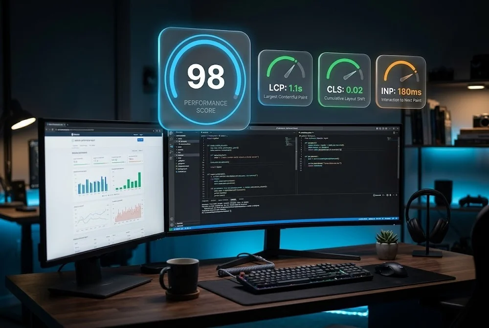
What actually moves LCP, CLS and INP, plus the website speed wins most teams skip.
The layout, hierarchy and proof decisions that turn cold traffic into qualified leads in seconds.
From first sketch to launch day, we design sites that look unforgettable and convert like they mean it.